Archie has announced a new series based on one of their original superheroes, the Fox. Here's the first paragraph of their press release:Eisner Award winning writer Mark Waid (Daredevil,
Thrillbent) and Emmy winning writer/artist Dean Haspiel (Billy Dogma,
HBO’s Bored To Death) are teaming up to launch a brand new series – THE
FOX. Taking place in the Red Circle universe, this exciting creative
team will deliver an innovative, action-packed superhero story starring
the fabled pulp hero.
AAAAARGHH!!. NOT A PULP HERO! It seems fashionable these days to call every character that comes down the pike who debuted in the 1930s and 40s, "pulp". Green Hornet: radio, movie serial and comics, not pulp. Captain Midnight: radio, comics, big little books, movie serial but not pulp. Miss Fury: comic strips and comic book reprints, not a pulp. The Fox: comic books only (and even then a back-up player in anthology books in the 1940s).

What's annoying is one of Archie's heroes did make it into the pulps, but that was the Black Hood. One of the few to start in comics and branch out into pulps and not the other way around.
Is it a big deal? Well, imagine if they said that Mark Waid was the Emmy winning writer and Haspiel was the Eisner award winner. They're both award winning writers so it doesn't matter if you got the specifics wrong, right? If you are going to talk about the history and pedigree of the character, at least get the terms right! It's funny in that they even say he's a "fabled pulp hero" as if these non-existent pulp adventures are well known! Just further drawing attention to the ignorance of the writer.
Can you imagine any other industry not knowing their own history, apparently superhero writers, editors, publishers and fans not knowing or caring about the distinction between comic strips, comic books and pulp magazines? Would you say Peyton Manning is known as a professional Rugby or Soccer
player? Would you read a newspaper or watch the news that regularly
called North Korea South Vietnam or take seriously a sportscaster who
didn't know the difference between referees and umpires, said that the
players, cheerleaders and band members wore costumes but the mascots
wore uniforms and that a "match" of football was divided by "innings"?
Or a retrospective on Andy Griffith talking about his home-state of
Alabama which also served as location for the fictional town of
Mayberry, the movie drama where he played a police commissioner? This is
not the first time. It's a recurring problem with articles, CBR, the
companies and the writers, all using the term with a fairly specific
meaning incorrectly. It shows a ignorance of their own history and
industry terms. I expect a press release to KNOW what they are talking
about and since they are advertising the character and trying to talk
about his history to actually get it right.
----------------------------------------------------------
Black Beetle: No Way Out #3. Franchesco Francavilla's Black Beetle mini-series appears to be a success. Francavilla has been making a name for himself with his covers and artwork, reminding me of old-style movie posters from the 1960s and 70s but his subject matter incorporating all kinds of kitsch and love of campy horror and science-fiction television, movies and pulps. Much as Mike Mignola has done with Hellboy and his interest in giant monsters and the late Dave Stevens did with the Rocketeer, Francavilla has channeled his interests into his own character and series, the Black Beetle. The Black Beetle has his roots in pulps and pulp-styled characters, and while there's a hint of mysticism and darker going ons in the "Zero" issue, this mini is more crime oriented, with him investigating who would put the hit on several mobsters as well as having a colorful, larger than life villain lurking in the shadows. The artwork and limited color palettes that Frankavilla loves so much makes it seem both rich but full of shadows and atmosphere.
If there's a weakness, it's in that we don't really get a sense of who or why the Beetle does what he does. In this issue, he's seen without a mask though his face stays partially obscured by shadow most of the time and even then we discover, it's a mask. Now, there are several pulp heroes who we know little or next to nothing about, but in those cases it's also clear that it's a deliberate part of the character's mystique. Also, unlike the Black Beetle, those characters are surrounded by other people who we do get to know a bit about. In writing The Shadow, Maxwell Grant dubbed "proxy heroes" as a term for heroes that could investigate and drive the story while keeping the Shadow mysterious and in the background. The Black Beetle doesn't have proxy heroes though, nor normal people such as agents, aides, or friends that he can interact with, to give us more of an idea of what kind of man he really is.
I also didn't care for the big fight scene this issue as it goes meta-fictional on us, appearing as if shot from a comic book that wasn't properly lined up so everything at an angle and panels running off the page and the proper order of reading the panels obfuscated by the bizarre layout. It takes the reader out of the world and the immediacy of the action. Interestingly, it shares this with the other pulp-like title that came out this week.
Five Ghosts: The Haunting of Fabian Gray #2. The second issue is a rocking roller-coaster ride from start to finish. Fabian and friend are captured by some odd natives and taken to be sacrificed to giant spiders at the supposed abandoned temple. They make friends with a martial artist who carries a charm that has some kind of link to Fabian's powers. And, we see where the powers can be truly dangerous, especially when one of the ghosts you call up is blood-crazed vampire.
The first several pages is an example of decompressed story-telling where it works. No words, but we see who the woman in the coma is and what she means to Fabian. It uses cinematic storytelling and widescreen panels to good effect. However, it also fails in that it goes just a little too far in being clever for clever's sake and not simply for good storytelling purposes. Because, the method is that each panel on the page is from a different point of Fabian's past. The top panel of each page tells one narrative, the second from each another and so on. However, it's more than two pages and starts on page 1. It's only when you turn the page that you see what they are doing. And, then to properly follow the sequence of events, you have to turn the pages back and forth for each narrative. This would work fine on a two page spread where you can read straight across the spread, but doesn't really work for more than two pages as it makes the reader aware of the mechanics of following the story.
Likewise, the sequence really was needed to have been in the first issue as it explains a lot of the motivations and relationships of the characters especially in terms of this specific story. Probably will read fine when read in one sitting or in the eventual trade.
Masks: It appears as if Masks is throwing the other conceit or premise the mini-series was based on out the window. The first being that this is a team-up of various pulp characters. Several are not only not pulp, but others are given new origins and back-story for the purpose of the mini, so it's not the characters at all but thin copies. The other premise was that this is supposed to be a retelling of sorts of a specific Spider novel. Thus, you expect some fidelity to that source material. However, the latest issue that I've received seems to be setting up the Clock as the main bad-guy. Now, I've not read the original Spider novel this storyline is from, but I'm reasonably sure that the Centaur/Quality hero was not behind it all. Not to mention the cliche of having it being a former hero going bad or trying to justify extreme actions through "ends justifies the means" excuse. Again, the premise works when the creators byword is "fidelity". As the series is winding down, can only wonder, what's the point of it?
----------------------------------------------------
 One of my favorite revivals was in the 1980s when Archie published The Mighty Crusaders. Of the many times that companies have dusted off old properties and characters, this is one of the few times that I thought a company did it right. At least in the beginning. At the time, I had no awareness of the original comics of these characters or the history of them other than what the press releases told us that these guys had been around for awhile.
See, it didn't matter that the last time most of these characters had been seen were almost two decades before. The series played it as if it was just two months ago. The series didn't act like they had been retired or away for any extended period of time. A nod to the 1940s history of the original Shield, but no one asking where the others had been since they last appeared. The first few issues worked great at reintroducing these old characters, allowing them to have their history without bogging a new reader like myself with continuity knowledge. The fact that each of the heroes could have their whole origins explained in about six panels in the back is a testament to the power of a good concept and compressed storytelling.
Recognizing they were a little light in diversity, instead of changing the gender or race of established characters, they created a couple of all new ones! Won't say that Darkling and Malcolm Reeves were necessarily stellar creations, but they could be accepted on their own merits without sacrificing the standing of any other characters.
Every revival of the team since then has been "let's not do that". Admittedly, that revival didn't last long, but I chalk that up to the quick downturn in quality. Dull writing, lackluster villains, even the printing became cheaper. Somewhere, they forgot that Steel Sterling should be the equivalent of Superman and became just a body-builder hero with teen hanger ons and social interest storylines that felt almost like recycled plots from afternoon specials. I think if they kept up with the richness of the superhero-verse they started with: giant robots, space aliens, beings from other dimensions, magic and science-fiction, dangerous supervillains, etc. Heroes being heroic fighting villains being bad, it might've been something really good.
So, not much interest in Archie's current take. Most of the heroes are back long enough to be shown to have gotten old and then getting killed. The focus is on a diverse cast of teens taking on the predecessors' names. Right off the bat, it's more like the other attempts with these characters in that it's about people with the same names. And, despite all the death and teen angst, the artistic style is cartoony as if that's all it takes to make it "fun".
Remember when DC wanted to youthen the JSA a bit so they brought in a grown up Robin, a time-tossed Star Spangled Kid and CREATED Huntress and Powergirl. Later, Thomas would create Infiniti Inc., new characters that didn't automatically overwrite the old ones
Tuesday, April 23, 2013
The Fox, The Beetle, and The Gray.


Wednesday, October 06, 2010
Todays Comics Looking to the Past
 Since I probably won't be getting any new comics this week and I've not talked about comics in a little while, here's my chance to plug away.
Captain America: The Patriot: Two issues have come out and I'm conflicted on the book. General consensus on the web seems to be as well. Most seem to praise the artwork over the writing (I guess because Kesel is not Brubaker) whereas I'm a bit the other way around. Kesel does seem to be writing Brubaker-lite, but I think he does an admirable job at writing the history of a man whose history is generally known. He succeeds in doing so without actually changing known facts and keeping the focus and point of view on Jeff Mace and his view of things. The art is passable in most places and is in keeping in toning down the gosh-wow factor of superheroes and their costumes that passes for good superhero art these days as half the artists seem embarrassed at drawing superheroes.
The second issue is where it really begins to falter. The problem is that while it is telling a good character-centric story and makes Jeff Mace seem like a decent and likable lunkhead, it and the art never get across why the characters are cool characters. The highlight of the whole issue is when he gets fed up with Namor's snarkiness and attitude and punches him. There you see his passion. Otherwise, as soon as Mace puts on the Captain America costume he becomes a second-rate hero in his own book. Every story of the fill-in Captain Americas center around why they were bad Captain Americas. As this is his chance to shine, it would be nice that the focus went the other way, why he was such a good choice for Captain America. Maybe the best choice for the time period. There are little bits where he shines such as the afore-mentioned conflict with Namor, but otherwise it is more about his shortcomings.
Other little things that bug me, Kesel seems to forget that the Bucky he's writing is not the original Bucky, at least in the way he writes him. Bucky comes off as a better fighter and hero and constantly berating Patriot-Cap, even though Patriot would have been a superhero for much longer. And, this Bucky has only been Bucky for just a couple of months longer than Jeff has been Cap, so it seems especially strange for Bucky to constantly be talking and acting as if he has so much more experience.
Kesel also uses the term "blue ticketed" to explain the discharge of a friend of the Patriot's and his subsequent suicide and why Jeff cannot appear as Captain America at the guy's funeral. It is also used to explain why Jeff would never become the Patriot again as his appearance and impassioned speech at his friend's funeral in the guise of the Patriot would make that identity a pariah. However, what Kesel doesn't do is explain what "blue ticketed" actually meant. He gives us the effect, but the closest he gets to the cause is the Whizzer asking if his buddy had a girlfriend. A Blue Ticket discharge was a way to get undesirables ie blacks and homosexuals out of the service without it actually being a formal dishonorable discharge and such a discharge haunted the men back in civilian life. Sure, we don't want clunky exposition, but it could have been handled a little better.
One of the pleasures was seeing the focus on Miss Patriot in this series. Appearing only once in the Golden-Age, here and her identity as a fellow co-reporter of Jeff Mace's she plays a central role. From the start of the second issue, we get the hints of bad things to come, that is if you know the history of Captain America and Bucky. After WWII, there was an explosion of good-girl art and characters. Most of them were jungle queens, but Timely/Atlas/Marvel explored shapely female heroines along the lines of Sun Girl and Golden Girl. Thinking that Captain America might do better with an adult female sidekick, Bucky is shot by a lady criminal called Lady Lavender and Cap recruits the help of Golden Girl who is Betty Ross, a long recurring character and possible romantic interest in the Golden-age Captain America tales.
That's a lot of threads being tied together in this one comic. We see Mary/Miss Patriot several times with a mention of her Lavender perfume each time. One discussion even centers around Jeff accusing her of hoping that Bucky is shot so that she could become his partner. Then you factor in that Jeff is generally oblivious of her romantic feelings for him and that he pretty much ruins her career as Miss Patriot when he destroys the Patriot's reputation. Mary's path is obviously becoming a sad tragic one. And, when Bucky is shot at the end of the issue with the smell of lavender in the air, Cap will get a future female partner but it will not be Mary. What we don't really get is the feeling that Mary has gone over the edge. We see her as being sad, but we don't actually see the bitterness. You feel sorry for her but don't see that final step or sign that she has gone over the edge, it's a huge gap in the portrayal of her characterization. It might be Kesel just trying to be coy for just a little too long, or a sign that she's not really the villainess (after all other women probably wear the same perfume). Either way, it's obviously going to be a story that doesn't end well for Jeff or Mary.
DC Universe Legacies #5: I had sworn off this book, didn't get issue four because the writing had so many holes and internal discrepancies in it that it was a chore to read to try to figure out exactly what the point of it was. However, issue five shows this book's perspective of Crisis on Infinite Earth's and with it, the wonderful George Perez doing what he does best: drawing scores of superheroes on model in big battle scenes. Not only that, we get an appearance by one of my favorite wonky silver-age characters Ultra, the Multi-Alien, who was left out of the original mega-mini. Couple that with a great little back-up with art by Walt Simonson teaming up Space Ranger, Adam Strange, Captain Comet and Tommy Tomorrow. Other than Adam Strange, the others don't have much to do, but it's great seeing them again looking the way they should.
And, as I usually come down hard on colorists, this is a book where the colorist gets it. His skin tones are natural and subtle, no obvious banding to the point that under most lighting conditions, people's skin appears only to have two tones, you generally don't have bright highlights on skin. No blurring of speed lines and edges of super-speed characters, no obvious texture fills, etc. In general, no special effect that actually draws attention to itself, the coloring instead serves to help the art to tell the story, something important in artwork that's dense like Perez.
While the writing still makes as little sense as ever (we have references to Judomaster as a modern day hero and Captain Atom in a costume he didn't actually wear in the DCU other than as part of government cover-up suggesting a career that was longer than it was), it's at least a book that looks good.
JSA #43: It read like a setup issue by a writer who is not the regular writer of either principle character of the story or title with a plot that has similarities to the upcoming story arc by the new regular writer, the JSA take over the running of a town. Just as Robinson's JLA/JSA arc featured heavily Obsidian going bad/being taken control of immediately after a series culminating with Obsidian stating that would never happen again. Serious, what is the editor doing on this book?
I think part of this was to actually give some kind of reason that Robinson's storyline mattered. Because, otherwise, it's no big deal that Obsidian and Jade cannot be in proximity because other than their days as part of Infiniti Inc, they rarely are featured together, each following different paths and teams. And, she's been dead. So, he needed this bit of durm und strang to make it seem like what just happened was this really big deal. However, just how much time has passed between issues? For everything that Alan Scott has done on the moon it would have to be close to a year at least, that he's been able to master talking to different races in their speech patterns, broker truce treaties with various worlds and realms AND research with Fate Obsidian and Jade's condition and the various futures.
Project Superpowers: Chapter Two #12: The final issue of the second series, the big Claw battle seems almost like an afterthought. In many ways it's a retread of the previous battle with Zeus, the heroes fighting a giant god-like being that they don't have the power to kill. The Claw battle has a bit more of a philosophical/moral dilemma in that his body is made up of innocents and thus to defeat him means killing or condemning thousands of people who don't deserve to die, drawing parallels to dropping the Atomic bomb to end the war with Japan. It's an anti-climactic ending though. Part of that was rendering the heroes ostensibly immortal and another that the Claw is such an ill-defined threat. And, you have the heroes apparently readily accepting Dynamic Man and Power Nelson into the folds despite their traitorous crimes.
In Chapter One and the Death Defying Devil minis, the Claw was a terrorist organization and an almost demonic entity that possessed others. It was a storytelling device that could have been used to fuel quite a few different type of stories or a long series in and of itself ala the mostly excellent JSA vs Kobra mini. But, much of that is dropped in making him a more physical threat. He goes from some kind of long plan insidious goals to one of more direct physical confrontation and easily handled. The actual terror of what he is and what he does doesn't really come across as it has been too far into the background of the storyline that focused more on Zeus and the identity of DDD. What could have been a heart and gut wrenching tale is ho-hum. After all, the Claw only absorbed one person we could even possibly care about.
The drawing AND the coloring improve. In a book like this, cannot really separate the two, but for the most part, the two do merge to make single whole. Although, the style has its shortcomings such as a page that has a 15 panel grid of single heroes in battle. The panels are too small, the detail needed too tight for such over done coloring. Time Masters: Vanishing Point: The mini suffers from not having any clear direction or plot. We know the over-arcing plot, that the small group of heroes are traveling through time to rescue Batman. But, as his return is the focus of another book, that's obviously not the point of this one. So, instead, we have a battle alongside heroes of other times against other ill-defined threats. Meanwhile some classic mastermind villains are exploring the remains of Booster's headquarters, Vanishing Point, for some clues and power to reshape time. Despite these villains each being scientific masterminds, they are give little to do. The Ultra-Humanite is used mainly to being a short-tempered foil and for his brute strength. Jurgens does little to really explain or characterize many of the characters, some of whom who haven't appeared in comics for decades.
With the second issue, I noticed the art looked off. It looked a bit like Jurgens but it seemed to be more of all of his shortcomings and not his strengths, that bodies looked stiff and disproportionate, reminding me of bad Jim Starlin in places. I looked at the credits and saw that Jurgens was only the layout artist and with two different finishers, explaining the inconsistencies. With issue three, we still just have Jurgens on layouts but at least only one guy doing the finished art. However, it still looks like "bad Jurgens" art. One of the big problems is that with both issues, the art is trying hard to have all the principle characters with their bodies facing the reader. Heroes are constantly fighting threats behind them and looking over their shoulders, having conversations while not facing each other, and so on. One panel has Booster and Starfire talking about being surrounded. Not only are they hardly surrounded, but half of their foes are not even looking at them. It looks more like a group of people just milling around than any kind of threat. The one good news is that either the coloring is not as bad with the computerized effects or it just distracts you from it.
And, why is the Black Beetle almost completely red?
The only reason to get this book is the chance to see Bronze-age characters like Claw and the original Starfire, Despero and Per Degaton in their original looks. For that, I'm a sucker.
Peter Cannon, Whereforth Art Thou?
The story goes that shortly after DC canceled his series and he made a couple of appearances in Justice League Task Force, the rights to Peter Cannon, Thunderbolt returned to his creator Peter Morisi, shortly before he died. As such, he was the only character that was part of a Justice League book to not appear in the JLA/Avengers mini. Of course, there was some justification that that the heroes that appeared in Task Force were never actual JL members and so didn't require an appearance, but he is still the sole notable exception. Even Hourman from the same story was in there.
However, we have Thunderbolt appearing in TWO different DC books this past month. One, alongside the other Charlton heroes in DCUniverse: Legacies #5 which admittedly has other problems in the same panel: the WWII Judomaster and Captain Atom appearing in his red, blue and silver outfit when he wasn't really on the scene at this time, in this costume, both being government fabrications. Meanwhile in Justice League: Generation Lost, we have a retelling of the scene in Kingdom Come where the Charlton heroes alongside Magog track down the Parasite who uses his powers to split open Captain Atom and setting off an atomic explosion and is pretty much the kick-off event of that mini. In the comic, Thunderbolt is identified by name and is show in the more GA Daredevil influenced costume.
Makes you wonder what is going on. Do we have two blatant examples of editors just not doing their jobs and allowing the exact same copyright infringement? Is the original story about the character's rights reverting to Morisi just a comicbook legend? Did DC buy the character back? Of the three, I'd say the latter is the most unlikely. Why buy the rights back and debut him back into the DCU in what are largely throwaway scenes where the character does absolutely nothing? Either of the other two are the most likely though it's strange to see him appear in two completely different books out of the blue. But, no love for the Son of Vulcan (I like the name, design and concept of the character, his actual comic though was beyond bad).
Black Terror Canceled. Been seeing references that the Black Terror book has been canceled. A shame but not surprising. The book never gelled, the plotlines and the stories never actually developed the character other than to add kewl pirate motif elements. What could have been a decent book about a super-powered Batman type character fighting super-criminals and bizarre mysteries never became anything more than a book about a perpetually angry and gruff hero. No supporting cast or characterization was developed over just following up plot threads left over from the Superpowers book itself. A shame as I believe Dynamite was right in focusing on him as a character to launch a single character title. He has one of the more iconic costumes, names and storytelling potential. If only they had approached it as they were telling a single character comic and not a "comic universe" comic and actually looked at the source material that made him such an enduring character and concept to begin with and not just the revisionist ill-tempered Black Terror of Superpowers.
The Return of the Originals: On the subject of pulps, I have started my own blog reviewing various pulp novels and characters. So far, two entries. One, a Secret Agent "X" novel and two, the Doc Savage rift Thunder Jim Wade and his final novel. This blog started off as a pulp and comic review site, but it's difficult to do both subjects justice in one place. Plus, the overlap may not be all that great as many fans and readers of pulps don't translate to being fans of modern comics, as we will see below.
Moonstone is getting ready to launch what they call the "Return of the Originals", ie seeing many of the original pulp heroes into their line of comicbooks. They've already been using Domino Lady although the first issue failed to me in any way other than just being badly done and the Spider has been appearing in some illustrated prose "comics". They have also published a couple of really good books, one being radio scripts of Doc Savage written by Lester Dent and an Avenger anthology of short-stories by modern writers, most of whom get the character far better than anyone at DC does (it could have used an editor overseeing the original stories as many centered around introducing various characters from Richard Benson's past).
This website has a host of interviews with people involved in reprinting and writing modern pulp stories and comics as well as many of the people behind Moonstone's upcoming foray (you'll have to scroll down to get to them).
One of the standard questions they ask is how the interviewee feels about DC's take on Doc and the Avenger and modern revisions/reimaginings of the characters. It's almost funny at the spin that each writer gives as they are all doing pretty much the same thing to different degrees. I give Hopkins a break with the Golden Amazon because she did have a couple of different irreconcilable back-stories. Sort of like the Alec Baldwin Shadow movie which tries to combine both the radio Shadow and the pulp Shadow into one character. The creators behind the Green Ghost and the Phantom Detective both talk about using as much of the original published history as possible. But, both decide to give them powers. While the writer of the Moon Man changes the gender of his chief assistant for no good reason (there's already a capable love interest in the original stories). The Ghost gets his new powers through a new mask and the Phantom Detective gains abilities through using performance enhancing (and mind altering drugs). What's really funny about this is the Phantom Detective writer brings out all sorts of psycho-babble to justify it, that he feels he's being made obsolete due to the explosion of costumed heroes with real powers. This is sorta true meta-fictionally. The pulp heroes did give way to the costumed comicbook heroes. In fact, the Phantom Detective was also in the comics as his publisher was one of the big companies at the time. HOWEVER, Moonstone does not have that superhero-universe. There are no true super-powered heroes bursting on the scene unless this writer creates them. Plus, it's a flawed argument in that the presence of superheroes does not make police, soldiers, firemen and detectives superfluous. It's a writer that truly does not get the character or subject matter.
Likewise, the interview concerning the Black Bat goes along the same lines. The character debuted the same time as Batman with a similar look. More importantly though, his origin was pretty much lifted for both Dr. Mid-nite and Two-Face, at a trial he has a vial of acid thrown at his face which scars him (and leaves him blind). After a secret experimental surgery, he discovers he can see in the day and night and with a small gang of aides, he fights crime. He's not above killing criminals especially the ringleaders beyond the touch of the Law, but he doesn't set out to kill them. Of course in the one online preview, we see him killing drug dealers execution style and driven by voices in his head. Yet, this complete revision of the character isn't seen as being the same as Azzarello's handling of Doc Savage? Maybe it's because they talk about how much they love the characters vs his professed disdain of the source material. What's sad is that this was not their approach to the Phantom. They wrote the character as he was classically but with modern threats and credibility. The character stayed in keeping with the way he was portrayed in the strips. You could go from their comic to the newspaper to old reprints and still see character as being completely recognizable, that you're obviously reading about the same character. But, their interviews are along Ross' and Dynamite's promos and talking about their Phantom comic. "Here's how much I love the character, so I'm going to change all this stuff about him."
Secret Agent "X" is about the only one we know that's going to be appearing that they haven't talked about. "X" has a lot of potential, especially as his past is a complete mystery so there's plenty that could be developed. However, based on what we've seen so far, I expect a lot to be changed concerning what the character already is.
A little interesting tidbit, the principle characters we know are being used, this is not their first time in the comics. As noted, the Phantom Detective appeared in the Golden-age comics, mostly intact. Secret Agent "X", Black Bat, and Captain Future all had their first stories pretty much straight-forwardly adapted though they all became Phantom Fed "X", the Mask, and Major Mars (the Captain Future id was used by a "standard" superhero). The Moon Man also made it into comics but with a name and costume change to that of the Raven. The Ghost got re-imagined in comics as superhero magician with true magic powers, dumping much of his pulp influences.
The comic store I frequent actually has several pulp fans, about five I think. Plus, he just got one more whose tastes seem to mirror mine own in modern comics only he gets even fewer than I do. However, he's only getting one issue each of these books and it's not going on the shelf. As the longest customer apart from the owner, more than likely I'll get first refusal. But, it doesn't speak well when the books don't even seem designed to appeal to those who should be their most core basic audience. Especially considering that pulp reprints are fairly popular these days and very pricey. If we're willing to spend $12-$16 for a forty year old reprint, we might be very willing to buy a comic for a fraction of that price if it at least played fair with us instead of pulling a bait and switch.
Tuesday, October 13, 2009
Comic Reviews and Doc Savage musings
Astra #1: Astro City and Kurt Busiek are exceptions to the rule for me in regards to the longer stories. Instead of feeling like he's stretching things out, he seems to pack more things in whether its character development or plot twists. He takes advantage of the longer story arcs to flesh things out but without forsaking the thrill of telling a story with superheroes. The longer stories are just denser and more layered instead of simply padded. Each issue is a satisfying read even if it leaves you hanging. The problem has been it has just taken so long between issues, but now there seems to be a renewed commitment to making Astro City more regular. The other thing is Busiek doesn't just tell the long big stories, but also the small short ones. Such as this, the first of issue of 2. It's more light-hearted than the recent storyline of Astro City, but it still manages to capture the times and cultural references, in this case the today of Hannah Montanna, Paris Hilton, celebrity tabloid journalism. Brent Anderson continues to excel at being a realistic artist with an organic line while still being able to capture the outlandishness and gosh-wow of a Jack Kirby designed world and make it all fit together seamlessly.
The Brave and the Bold #27: JMS delivers a fairly strong story with excellent art by Jesus Saiz (other than the cover with Batman's utility belt pouches being ridiculously big and out of place looking). Most of the story mines the human interest personal angle that Busiek does so well in Astro City. Sadly, the story ultimately fails in the end as it has to lessen the heroic nature of Robby Reed, that he was willing to let someone else die in his place and Batman just lets him off the hook.
Justice Society of America #31: Dissension in the ranks of both heroes and villains, the story moves forward with little character bits all the way around. Magog makes good arguments but only because it IS stupid to have the heroes just blindly allow people to walk right in without any type of clearance checks. Although it's one of those things like characters using the toilets. It's so obvious that I don't need to see the heroes do it in order to reassure me that they aren't all seriously constipated. If something is a completely logical and natural thing that any normal person would do, it doesn't really need to be shown unless it actually serves a plot point. What is stupid is that no one replied to his arguments pointing out that superhero teams aren't just about being armies, but also police force and rescue personnel.
JSA vs Kobra #4: Proving to be an excellent mini. Of course, part of that is this is how the JSA and JLA should have been treated all along, with them actually investigating and fighting villains, showing them off to be heroes. The focus is a little too much Mr. Terrific as if he's the only smart guy and the leader of the JSA, but otherwise a strong story. Thing is, this story could have easily been told with the original JSA as well since it's not a story ABOUT continuity but more of an action-thriller that superheroes naturally are and thus a natural fit to spotlight and show off any superhero team. Instead of Mr. Terrific, you'd actually have Hawkman showing up to be the tactician and leader that he was supposed to be, that carried the team for 40 years and Kobra being the world-threat that he always should be. Tell stories like this with the original JSA and no one would be wondering if the team was past its prime.
Marvel Mystery Handbook: I almost didn't pick it up as I don't normally get the handbooks, but there were so many characters I barely knew by name in there which made me just have to pick it up. Chock full of information and artwork.
However, the book is schizophrenic in just what it was trying to be and how it was to present the information. Just the format alone, in the first half of the book, there are power grids, ranking the powers using bar graphs., then for the shorter entries in the second half, it was decided the grids were too big and presented just the numbers for the scale of the powers. From a graphic design perspective, on projects like this consistency is the key. Keep in mind that reference books like this are not required to be read from front-to-back so a consistent approach is all the more important. If the grids are too big for some of the entries, chuck them entirely. Use the same format for each entry. Likewise, keep in mind that some people don't read all of the handbooks, so in the beginning should be an explanation as to what the power grids and numbers actually mean. How does a normal person have an energy projection of one and not zero?
Likewise, if you are going to divide a book like this into two sections so the entries are NOT in absolute alphabetical order, some kind of table of contents is required!
This is carried through with the artwork. Some pieces have art from the original stories, others have modern artists' takes on the characters. Some artwork is cited, others are not. Again, how the main artwork is cited in the longer entries in the first half is different from the second half. Again, there is reasoning based on the page layouts, but there should be consistency throughout the book. If the smaller entries require it to be alongside the pictures in the margins, then it should be that way throughout the book. If the artist is unknown, that should be mentioned instead of left blank. Settle on a single format and be consistent throughout the book.
One could argue that the reasoning behind some having art from the original stories as the main illo and others not is because of the difficulty in getting a good enough scan of the original art or an image from the one appearance that would be appropriate. Except when you get to the Namor entry. His main illo is of him with a modern look as done by a modern artist. There is NO WAY THAT A DECENT IMAGE BY EVERETT OR EVEN SCHOMBURG COULD NOT BE FOUND TO BE USED. Heck, even the small John Byrne pic would have been better since that was at least more consistent with the way he originally looked.
Which gets at the core of the other problem, what is the purpose of this book? Ostensibly, it's to celebrate the heroes who first appeared in 1940 and prior of Marvel Comics. That's fine. No Captain America, no All-Winners Squad, no Union Jack, Dominic Fortune, Two-Gun Kid, etc. Yet, the book is a big failure in that regard. It's full of modern continuity and retcons and does not distinguish between information found solely in the original stories and what is part of modern continuity. Thus for Namor, we get as his main illo artwork that is nowhere close to how he originally was presented. The same is true for Red Raven, Thin Man, Mastermind Excello and the Eternal Brain. The first sentence of the entry of Mr. E is retcon information from The Twelve, a mini-series not even done yet. While the Phantom Reporter leaves out interesting tidbits actually in his original story (his mask seemed to glow and he had another identity of a rich playboy with a different name). That's just wrong. At this point, you're not celebrating these characters from 70 years ago, you're celebrating modern continuity and too worried over how they fit in the scheme of things today.
The biggest example of this is the entries for Hurricane and Mercury. They don't have one. Instead they are a small part of an entry for Makkari. It's a prime example of why I don't like that retcon, it completely subverts the original characters for a much later one. He does not deserve an entry, much less a two-page one in a book about GA heroes. He was created in 1971 and his GA ties are retcon ones. If his retcon adventures qualify him, then they should qualify EVERY character whose stories take place 1940 and before including all the Atlas Western heroes, the medieval Black Knight, Freedom's Five and the WWI Union Jack, etc. This is a handbook of the GA characters that were introduced 70 years ago (or a little prior as the case of Ka-zar) and that's the history that it should celebrate. The retcons and modern continuity should take a backseat to the originals. It's as I always said about making the characters Mercury/Hurricane part of Makkari's identity, we lost them as characters. They are now footnotes of the Eternal's character, it's two pages of information that has nothing to do with the actual GA characters where he deserves no more than a sentence in their entries. And, this just highlights that fact. The one place where they could be given to shine and stand as equals among the other heroes created at the same time, they are treated as less than Leonard McKenzie. I'd rather have seen two short entries, and used the space to highlight some villains. Likewise, Namor's entry could have just ended around his revival in the FF and the role he played in the revival of Captain America and just a summation sentence that he was still active today instead of going on. And on. And on. Red Raven who appeared in ONE Golden-age story has a two page entry!
It's just too full of retconned and modern history without any clear-cut demarcation between how the stories were originally and what they mean in modern continuity. As a true golden age reference book, it's not very useful except for the few characters that haven't been touched by modern hands.
The Ka-zar entry is the way I would have preferred all of them to be, focusing on information found in the original stories, with little to no mention of modern-day continuity. Of course, it makes him a contradiction as well. Judging from the other entries, one would expect that we'd have just gotten the history of the modern-day Ka-zar as his appearance pretty much negates the GA Ka-zar stories as they relate to Marvel continuity.
Lastly, I would have loved to have seen more villains and other colorful characters and less of the secondary characters such as Professor Horton and Namor's parents. Seriously, how does McKenzie rate a full page entry when everything needed to know about him is covered in the Namor bio? Ditto on Horton. How big of a role is he as a character in the actual GA Human Torch stories? Almost all of the information is from stories decades after the fact. Did we really need to have separate entries on Zog and Electro? Less waste and less focus on all of the modern continuity, we could have possibly gotten EVERY GA Timely character that held his own strip in a book not much larger than this, maybe even a timeline of characters' appearances and history from a strictly Timely perspective.
Project Superpowers: Chapter 2 #3: Chapter 2 continues to be an improvement over the first mini, though it's still stuck telling basically one long drawn out story. At least, there's a feeling of progression as lots of things happen and most of them not good for the heroes involved. Although, the revelation concerning the Black Terror's kid partner Tim is very reminiscent of the fate of Tim in the Terra Obscura minis. Overall though, the over arcing meta story is really kind of boring and a tired concept.
Surprise, surprise, I even approve (or at least understand) of the small change to Skyman. In this day and age, a character using that name just because he pilots a specialized airplane just isn't going to.. um.. fly. So, it makes a bit of sense to actually have him be able to fly. Although, by jet-boots? It doesn't really work with the look of his character.
Project Superpowers: Meet the Badguys #2: Joe Casey manages to make the most out of the rather non-sensical status quo of the Fighting Yank in this "story". I also find it interesting that the Revolutionary has on his chest a ring of stars as that's the look of Roy Thomas' retcon character Spirit of '76, distinguishing him from the Fighting Yank who he was visibly based on.
Sadly, that's all that recommends this book. As per Casey's habit, the character the book is supposed to be about is not explained at all. No motivation for any of his actions. No backstory. No explanation of just what are his powers or the source of them. Like almost every story I've read by him, it's all set-up and no actual story. He seems to be trying to paint him as a possible hero or anti-hero and the fact that the seems a cross between Lobo, Ghost Rider and a cracked mirror reflection of the Yank is enough for the readers to know. As we have no motivation for his anarchic behavior and willingness to use potentially lethal force, we don't know why he is supposed to be considered a possible hero. Also, these are supposed to be the "bad guys" yet this issue and the last remove the teeth from the characters they introduce. It seems to be more of showing the feet of clay of the heroes vs the more pure if violent anti-heroes. Are they villains or not? And, when you have your heroes set up to be terrorists, what exactly makes these guys the bad guys?
The artwork is painted prettily in places but is bad at sequentially illustrating a story. Pages are often too dark while simultaneously being just unclear as to what actions they are supposed to be depicting. Of course, so is Casey's script, so in that regard they are a perfect marriage.
Sherlock Holmes #5: A bit anti-climactic in the ending as it's just a quick and easy trial, with little real drama as Holmes pretty much reveals that he already knew everything. Some things seem a little unexplained as issue 4 built up a master mystery thief but that goes nowhere other than to serve as part of the frame job of Holmes. Overall, not a bad story but a little bland.
The Torch #2: Great cover. The story is decent too in that we see what makes the Thinker a formidable foe. But, it's not really going anywhere either. Two issues into the story and all we really have is the original Human Torch revived as a weapon. Too much of the story is too busy being about continuity and explaining the continuity and not the actual title characters doing anything. At this pace, it's going to be an 8 issue mini that could have been done in three.
The problem is that writers today don't really know how to pace out story lines and subplots. A more talented writer would have found a way to have Toro in the main story being active fighting villains and finding his place in the modern world of heroes and as a civilian, while having the Thinker, his research and fan-boy need to over-explain every little thing serve as a sub-plot or second tier to the main story, building to a head. What we got is mostly boring and do we really care about this fine detail of why Toro catches on fire too? Is there going to be a big enough payoff in the relevancy of these details that has taken two issues to detail in such a dull way? Because, right now, it's not the story that's carrying the book or the title characters, it's the personality of the Thinker. Other than his characterization, it's not hard to see that this is largely the same creative team behind the above Superpowers book.
Witchfinder #4: Continues to be an excellent creepy and eerie book, a throwback to what made the Hellboy books so entertaining before they became about their own continuity. A shame that the timing couldn't have made it be a complete read in time for Halloween.
Pulp Matter:
An interesting synchronicity of pulp stories lately. At a recent trip to a local used bookstore, I came across a Bantam Doc Savage double reprint I didn't own. I think it may be the last of my holes with the doubles, now it's just hunting down a couple of the omnibuses. The two stories are "The One-Eyed Mystic" and "The Man Who Fell Up". Both are excellent stories with wonderful "impossible" occurrences drawing Doc into the action. In the pulps, only Doc and Monk actually have their hair color mentioned, so it's interesting that in the "Mystic" story we find out that Renny's hair is not red as that is his hair color in the DC comics from some years ago.
In "Mystic", Renny is on his way flying out for a vacation when he gets into an argument with a mystic on the plane. He falls asleep and wakes up as a two-bit crook, even looking like him when he looks in a mirror. He finds out that while he is this crook, there is evidence linking his real body to a murder that he knows nothing about. When knocked unconscious, he wakes up again as his old self in the town he was heading to. The mystery is compounded when later Doc has trailed the mystic aboard another passenger plane and under the cover of smoke while in flight, the mystic completely vanishes off the plane and is replaced by someone who insists he never boarded the plane.
Meanwhile, in "The Man Who Fell Up" the story centers around a body that falls out of a skyscraper only to fall up instead of down, a mysterious green fog, and strange attitudes by Monk and Ham.
While originally, these stories were written years apart, it's no coincidence they are paired together in this double. Despite wildly different beginnings, the inventions behind the actions of the bad guys are remarkably similar. There are other familiar tropes and storytelling choices that are cliched if you read many of these, so it's not too terribly hard to figure out who some of the bad guys are.
Meanwhile, Sanctum Books has released the second two-story reprints of the Avenger, reprinting the stories "The Sky Walker" and "The Devil's Horns" (as well as a Whisperer short-story "Boulevard of Death"). While The Avenger pulps advertised as being by the creator of Doc Savage, "Kenneth Robeson", the reality was that Robeson was just a house name for other writers. Lester Dent who wrote the majority of the Doc novels and had a hand in most of the ghosted ones, had little to do with the Avenger written by pulp writer Paul Ernst However, "The Sky Walker" involves a jet made of transparent materials, something that Will Murray ruminates about a bit in an article in the book. According to Murray, Dent apparently wrote a short-story involving a similar plot device early in his career but never published. Murray doesn't go into any more detail than that about this short-story. Even if not true, the plane in "The Sky Walker" still pre-dates Wonder Woman's by some years. What's not mentioned is Dent did get around to using that idea eventually. In the Doc Savage story "The Man Who Fell Up", Doc has a mostly invisible jet. Like "The Sky Walker", everything is invisible except for the engine. To aid the invisibility aspect, in the Doc story, the engine is painted to mimic the sky on the bottom and the ground on the top. It even mentions the one drawback, it doesn't take long for soot and all to gather on the otherwise transparent aircraft. And, like many of Doc's planes, it doesn't last 5 pages before it gets blown out of the sky, in this case by a man falling up. As far as I know, it's not mentioned again, presumably Doc saw it as a failure and by that point Wonder Woman was zipping along everywhere in her not too original Invisible airplane. It does give credence to Murray's wondering if there was at least some collaboration between Ernst and Dent though, especially if there's that unpublished short story out there somewhere. Maybe, we'll see it see print some day too.
Friday, March 28, 2008
The Crimson Mask

At the coner of East Avenue and Carmody Streets was a drug store with windows facing on both thoroughfares. A rather curious place too, because unlike modern drug stores it had no soda fountain, no display of candy or coffee pots. The only way a man could get a sandwich in that store would be if he were starving, and then the owner would have sent out for it. There were even the red and green globes in the windows that indicated that this was an old fashioned drug store.
The name on the door read “Robert Clarke, Ph.G.” and it might have been expected that Robert Clarke was as old-fashioned as his store.
Nothing could have been further from the truth. Bob Clarke was young, eager, and alert. He ran the drug store, in about the poorest section of the vast city, because he liked it here. Grown-ups knew him as “Doc.” The kids had coined a name for him two days after he opened the store. They called him the “Lemon Drop Man” because he kept a crystal container of candy ready, and the kids could get a handful for the mere asking.
Doc ran his business in a peculiar fashion, too. Some might have called it slipshod, and a good credit man would have promptly refused to extend any credit at all. For Doc was in the habit of compounding prescriptions and insisting that they be charged. He maintained that his customers – those among them who were pitifully poor – had enough troubles in paying doctor bills.
…Doc Clarke was the Crimson Mask. But only these three people knew that, or how and why Doc has entered this everlasting business of fighting crime, months before, and then only after a long and careful study of the subject.
The life he had chosen had had its inception when his father, a police sergeant, had been shot in the back by gangsters. Doc, a slender youth at that time, had seen his father die. He had seen an eerie phenomenon which had caused the blood to rush into the dying man’s face until it had formed a clear, vivid mask of crimson.
It was at that moment that young Clarke had made his vow to avenge his father’s death by making ceaseless war on all gangsters and crime and had taken his pseudonym and mask of identification from hi memory of the crimson mask of blood of his dying father’s face. Bob Clarke himself now had just such a mask – fashioned of crimson velvet. Although he did not have to rely on the mask to hide his real identity, since he had become an expert at disguise and mimicry.
Former Commissioner Warrick had helped him in all this. A life-long friend of young Clarke’s father, the wealthy ex-commissioner had helped the boy through the School pf Pharmacy, where he had gone with what money his father had left him. Now that Bob Clarke had graduated, and during all this time at school had been perfecting himself in all the arts that would make him a great detective, he was repaying Warrick in the one way the ex-commissioner wished to be repaid by making possible the dream of the older man’s life to wage relentless war on crime and criminals unrestricted by red tape.
(“The Crimson Mask and the Vanishing Men,” Detective Novels Magazine, 1941 by Better Publications)
 And with the help of Dave Small who helped run the drugstore as well as investigating and Bob’s girlfriend Sandra Gray who he met in an earlier case, the Crimson mask does just that.
The Crimson Mask was one of several detectives that semi-regularly appeared in Detective Novels Magazine in the early 1940s. The pen-name was Frank Johnson, but the writer was Norman Daniels who was a fairly prolific pulpster back in those days. He ghosted a few Doc Savages and contributed adventures of the crimefighters the Black Bat and the Phantom Detective.
I have to confess to feeling a little guilty. I have in my collection a Crimson Mask story, have had it for years and yet never read it. This issue of HIGH ADVENTURE reprints two of the Crimson Mask’s stories and they are both good little mysteries. “The Crimson Mask and the Vanishing Men” concerns bank messengers that disappear with the money they are carrying only to be found dead some time later. Even when the police and the Crimson Mask are keeping watch, the messengers vanish without a sound in the middle of crowded streets. “The Money Trail” concens itself with armored cars. When acts of sabotage and a bungled hold-up attempt that leaves one guard dead, the Crimson Mask investigates what looks to be vast swindle and a gang that aren’t afraid to kill to reach their goals.
The Crimson Mask makes for enjoyable reading. He’s capable but not so much as to distance himself from the reader ala Doc Savage, the Shadow, and the Avenger. He’s not shy about his girlfriend but none of that “can’t be together because of the dangerous mission” nonsense of the Spider and Phantom Detective. His motivation for fighting crime is personal and understandable. And, while he operates on the outside of the law and uses a gun, he’s respected by the police as a detective and crimefighter. His charitable work as a pharmacist helps give us a bit more than the usual insight to the character, he’s big on social justice as well as criminal justice. All in all, we get a hero who comes across as a genuinely nice and affable guy. The stories don’t deal with super crooks like Doc Savage and the other big guns of the pulps combat, they almost pale in comparison. However, they aren’t pikers either, they have unusual angles and ruthless men at the heart of them.
All in all, a lot of fun and a character I’d like to see more of. I’m going to have to hunt up that pulp I have and give it a read.
Tuesday, March 11, 2008
Dave Stevens RIP

It seems I write too many of these. I guess it comes from being around since the Silver Age and the fact that the comics industry has been around now for 60 years. The second generation of comics creators that came along in the 60's, well they are all now in their 60s and older if they are still around.
Still, Dave's death is a bit of a shock. He passed away at the age of 53 from Leukemia. A full account of his life and career can be found at the usual great Mark Evanier's
blog For once I can say I was at the right age when Pacific Comics and the Rocketeer came along. I was old enough and yet young enough to be venturing out of the big two superhero comics and trying out new books. And we had big name creators like Neal Adams, Jack Kirby, Steve Ditko, Mike Grell, Marshall Rogers, and Michael Golden all doing their own things. Amidst all of that was this upstart Dave Stevens bringing a retro strip in the back pages of Grell's STARSLAYER. For me, a long time fan of Doc Savage (and blissfully unaware of how much pulp stuff I knew nothing about) with an intellectual interest in the old serials (as I'd never seen one at this point), it was a dream come true. Stevens dusted off the old King of the Rocketmen concept and streamlined his helmet a bit, rescued a sex-kitten model and a hulking brutish looking actor from obscurity as models for principle characters, peppered with planes, locations and people of the 1930s as well as a few appearances of some un-named pulpish characters and mixed them all together in a wonder strip. The Rocketeer was to comics what Raiders of the Lost Ark was to movies, capturing the fun of the time when adventure was always around the corner and could be had for a dime.
I remember being excited to see the movie and it remains as one of the most best adaptations of a comic character to the big screen. Despite Peter David's rather uncharitable snipe against the beautiful Jennifer Connelly. While there are specific changes to different elements of the comic series, the movie stays true to the spirit and themes of the comic. It doesn't camp things up, dumb them down, make wholesale changes to the costumes. It plays it straight and is just plain fun. Unfortunately, it opened with less than stellar numbers, unfortunately coming out as the same time as a little flick called T2.
Stevens wasn't the most prolific of creators. Nowadays, that doesn't seem to be a problem for creators. After all too few issues, the comic eventually faded from view and Stevens became known for covers and pin-ups, often of sexy scantily clad women. It was something he was very good at. For good or ill, his art sparked a resurgence in what is commonly called "good girl art" as well as a renewed popularity in Bettie Page. Without Stevens, who knows if we'd have seen the likes of Adam Hughes and Frank Cho, both artists not threatening to be accused of being speed demons themselves.
 In this day and age of trade paperbacks as secondary markets and habitually late creators, it's a shame that Stevens wasn't able to do more work. He'd be tailor made for limited series with minor characters, counting on long term gains on that secondary market. How much money has DC made from keeping WATCHMEN in print? And how many times have we seen reprints of the Kree-Skrull War, the Avengers-Defenders War, and the Adams Green Lantern-Green Arrow issues? It seems the companies would be wise to develop more properties geared for more long-term publishing in the trade markets. As opposed to things like 52, Civil War, etc that are dependent on being enmeshed in current continuity than able to really stand on their own. But, those are other thoughts.
Here's to ole Dave Stevens. By all accounts a helluva nice guy, a drawer of purty pictures, and a fan of those things from the age of action and adventure. I had to include the pic of the gun toting opossum for the sake of my brother, a big fan of those skittish critters. 

Monday, December 03, 2007
The Secret Secret Origin of Superman?

We got letters! If you wish to read them in full, just scroll down to the past blogs, specifically the Stardust and Green Lama focused ones. However, I do want to call attention to them and a couple of links they provided. Paul Karasik reminds me that the name of his Fletcher Hanks book is “I Shall Destroy All the Civilized Planets!” and is currently on its third printing! Way to go Paul! Also, there’s a link provided to a Fantomah story not found in the book if you cannot just get enough of Hanks’ oddball style to:
http://www.fletcherhanks.com
Writer/artist of the Green Lama mini coming from AC Comics has a preview of the first issue up at his site (there are a few more pages in the printed book, he promises). So, if you a bit more of a sample than the cover image:
http://www.comicspace.com/james_ritchey_iii/
The Secret Secret Origin of Superman
In talking about his upcoming book “Our Gods Wear Spandex”, Chris Knowles compares Joe Shuster’s iconic cover of Action Comics #1 to the renaissance painting “Heracles and the Hydra” by Antonio Pollauoio. By comparing angles and such he scores a few hits in making an objective and informed argument, even if to do so, he must in one instance have Superman be the same size as the Heracles figure and in another, change the size of the figure so as the Hydra and car line up properly.

But, where he falls is when he tries to take the arguments further and what he actually ignores. A problem I had in my younger days with English teachers and criticisms. They become so concerned with intellectualizing a story, with dissecting and codifying it into themes, metaphors, and symbolisms that would put Dan Brown to shame, they forget the actual story and confuse it all with actual intent and fact. Many times, the symbols and themes that one sees in a story inform us more about the readers than the authors, it’s what they bring to the book not necessarily what’s really there or intended. Ask Roy Thomas about the sexuality of Union Jack and Dynamite in THE INVADERS sometime, something many readers and some creators thought was very obvious. Until someone actually thought to ask Thomas what he intended.
Despite his objective hits, in his subjective arguments Chris Knowles shows many holes in his reasoning. First, we’ll look at the painting. 1) While Kane is known for using swipes, Joe Shuster used models and tons of assistants. But no one before has really shown a link to any swipes. 2) While swipes was indeed a common practice, most of these artists were pulp and comic strip fans and indeed aspired to working for them and as such, swipes tended to be from those and other illustrator sources. Not museum pieces. (And for a painting that he claims is famous, as someone who read a lot of mythology and was an art major for 3 years in college, I cannot say if I ever saw this painting before). 3) I’ve never seen in the history of swipes or homages or what you want to call it, where the energy and direction of the two pieces would be so dissimilar resulting in a completely different effect.
The last part is where I really have trouble with it. He argues that the anatomy of the Shuster figure seems off, yet I don’t see any inconsistencies in it especially compared to his other drawings. What it does show is a very different style and approach to drawing, more akin to the pulp and comic strip illustrations. Whereas the painting Heracles does look stiff and awkward and suggests impending action. He’s rearing back, preparing to strike, all the energy and the viewer’s attention is being pulled into the Heracles figure. Shuster’s cover instead is action personified, a violent explosion emanating from the Superman figure as he is shoving the car forward while in full run, the dashing against the rock with parts flying and people fleeing outward. The two works are almost complete polar opposites in the way they actually read which is not something one aims for when choosing to actually reference an earlier work. You use the reference to gain a similar effect, to help get it right. Not to do it differently (unless you are purposely parodying or critiquing the reference).


In looking at pulp covers, I came across a cover from 1935 that is very simlar to the running pose of of Superman on that cover. In fact, other than the position of the arm, I think it has more in common with the Superman figure than the Heracles does. For one thing, much of the energy, the suggestion of forward movement is the same. And, then there’s this 1936 issue of MORE FUN COMICS, a title Siegel and Shuster were doing Doctor Occult. Look closely, and you’ll see the same triangle frame-work that ACTION COMICS #1 and the Heracles painting share though reversed. But, noting the similarity and actually arguing the intent are two different things.
As Knowles goes on, it becomes obvious that he’s over-intellectualizing in his approach to Superman and other early comics. He sees similarities and relationships without taking into account contexts, without actually looking at the creators or the time period they and their works exist in. From his interviews:
This all started with a nagging question: Why would Superman wear a cape? It would be a liability in a battle; it could blow in your face and block your vision at the worst damn times. And what about the Spandex? Superheroes like the Shadow and Doc Savage were around before Superman and most of them didn’t run around in skintight clothing, right? Well, perhaps it’s because the guy who created Superman had his sights set on an earlier role model.
… Well, I got to thinking that it reminded me of Hercules and his lion skin, which was always flapping around in the breeze. Of course, I thought this until I saw "Heracles and the Nemean Lion" by the Renaissance relief sculptor Antico, which pictures Hercules almost exactly as Superman is today: short, wavy hair, long, flowing cape and naked, muscular body. Well, OK, add the Spandex and the underpants and it’s Superman.
Except for a few other nagging details. Because, instead of looking to the sources, to the accounts by Siegel & Shuster, to the context of the times and the types of works that they and other creators stated as serving as inspirations for the characters, he runs with what the character reminds him of. Right away, he's judging the work through his own eyes and perceptions instead of actually being objective.


If you look at Siegel and Shuster’s own accounts and such, we know they read pulps. In fact, the pulp that inspired both of them, the one that contained the first Buck Rogers story, but whose cover of a flying man (not Buck) seemed to be a watershed moment for many early science fiction fans and wannabe writers, I’ll be danged if it doesn’t look too different from a superhero type costume. Tights were already being worn by the Phantom in the comic strip pages. An early drawing of Doctor Occult in superhero costume shows him in cape, tight shorts and boots, looking very much like covers and the St. John drawings of Edgar Rice Burroughs’ John Carter. And you have Tarzan himself flexing his muscles fighting lions and such. There were covers of Doc Savage where he wore just shorts, looking very much like a superhero. Keep in mind that Carter’s abilities and all were Superman in reverse, an Earthman on a warlike planet with lesser gravity giving him vast powers and able to bring about justice through that greater strength. Circus performers, weight lifters and other professional strongmen (http://www.bernarrmacfadden.com and www.redboots.net/comics/powers_costume.htm) had been sporting similar outfits for years whereas Lee Falk credited portrayals of Robin Hood in tights inspired the costume of the Phantom. Either way, there’s plenty of direct popular sources for adopting such a look that don’t require a trip to the library or museum. The precedent is in place without them re-inventing the wheel. And Knowles doesn't provide a logical reason as to why his Heracles theory should carry more weight.
No one is arguing that Hercules, Samson, Gilgamesh and Beowulf aren’t the grand-daddies of them all. But, Knowles wants us to believe that they are the direct sources, the direct links. Because it makes the comics sound more intellectual and cleverer than they in reality were, drawing inspirations not from classical literature but the pop culture of the time. It sounds better that they are using renaissance paintings and classical sources for their inspiration instead of some decades old pop culture source a couple of times removed that the general public will never have heard of.
Just as he also suggests that Jerry Siegel and Joe Shuster seemed to be into the occult and that Lex Luthor bears a strong resemblance to Aleister Crowley. Forgetting that Luthor wasn’t bald to begin with, the argument is spurious at best. Shuster’s drawings were primitive and cartoony in likenesses for all the energy and luster they could have. To say any one character bore a strong resemblance to a living person would be hard to prove. Why not say that it was the actor Lionel Barrymore that fueled the likenesses of Luthor, especially in the post “It’s a Wonderful Life” years? Why would anyone base a mad scientist on Crowley anyways?
And again, to say that early comics were interested in occultism… where’s the charge that Siegel and Shuster were interested in law enforcement and spies since they did strips starring such characters? The real truth is messier and more mundane. First off, both were Jewish just as I’m a Christian. With that comes a bit mythos in upbringing and heritage. One doesn’t have to look any further than the Old Testament to see where the likes of the Spectre comes from. It’s not a question of some esoterical and exotic interest that makes the creation and artform more glamorous, but one of simply heritage and religious background. An everyday humdrum background and heritage that millions share. A lot of comics did deal with ghosts, vampires, magicians and sorcerers, things a little bit out of the purview of that background.
You want an explanation for the ghosts, ghouls and other nightly creatures? Just look again to the pulps. Even by the time of the creation of Doctor Occult, the extremely popular WEIRD TALES had been around for over a decade with tales of Atlantis, heroes on other planets, and ungodly creatures. A steady diet of the likes of Lovecraft William Hodgson’s Carnacki, Seabury Quinn, Manly Wade Wellman and Robert E. Howard will give you enough inspiration to last a lifetime without doing any kind of formal research. You also have the Universal Horror mo vies Dracula, Frankenstein, The Mummy; the popularity of magician characters such as Chandu and Mandrake, and so on. You don’t need a deliberate interest in the occult more than a general liking and reading of such tales, gaining information second hand from the gestalt of the popular culture of the time any more than Jerry Siegel needed an interest in Entomology to make the comparison of Superman’s leaping ability to a human sized flea. And, the truth is, these comics weren’t all that intellectual. I’ve recently read several werewolf comic book stories, one where the creatures could turn others into creatures like themselves just by their howls and could be killed by bombs and another that stated the preferred method of killing such a creature was a stake through the heart! There's very little indication of any serious research beyond one of today's youth writing a vampire story based on knowledge solely gleaned from watching Buffy and Angel and never reading Dracula or even more obscure tales.
These are people making it up as they go along, pulling bits and pieces from all these different sources that are part of their individual make-ups, from what movies they’ve seen, what books they’ve read and just from what they see in their culture every day. It’s messy and inexact and inaccurate so the method to kill a werewolf is taken from how to kill a Hollywood vampire. It’s not pretty. It’s not people going to the museum or the library to do hours of research as much as it is pulling from various sources just laying around and looking at what succeeds on the next rung up. It’s not glamorous and offends our ideas as we think artists and creators should be all about creation and being Artists. And, too often, comic book fans want to legitimize their hobby and hold it up as high Art by denying the true fact that it is a craft and trade as much as art, meant to tell stories and to entertain and excite. Read some golden-age comics. They are fun and full of potential, rawness and creativity. And many are poorly drawn, stories badly structured and full of latent racism. But, they ain’t intellectual.
Friday, November 30, 2007
The Secret Secret Origin of Batman.

Tell me if you heard this story before: A wealthy young man whose family is a victim of crime with the help of the family butler puts on a dark costume inspired by bats and seeks justice. His secret hide-out is a cave.
Or maybe you’re familiar with how a hero gains the inspiration for his identity: “he must become a figure of sinister import to all of these people. A strange Nemesis that would eventually become a legendary terror to all of crimedom...he glanced at the oil lamp burning on a table. Then he swung around, suddenly tense. In the shadows above his head there came a slithering, flapping sort of sound.”
…”leaped back instinctively as something brushed past his cheek.
Again the flapping of wings--a weird rustling sound. Terror overcame him
for an instant as something brushed against his hair, caught in a tangled
lock. Something that seemed unspeakably evil.”
“He reached up, tore at it with fingers that had suddenly grown frantic.
He flung the thing aside. As he did so he saw that it was a bat. An insectivorous
mammal, with its wings formed by a membrane stretched between the tiny
elongated fingers, legs and tail.”
“As the creature hovered above the lamp for an instant it cast a huge
shadow upon the cabin wall.”
"’That's it!…. ‘I'll call myself…’"
If you’re thinking it’s Batman, you’d be wrong.
The first is the story of The Human Bat who first appeared in Britain in THE FUNNY WONDER, March 1899! It’s the story of John Holloway whose father is swindled out of his wealth and title. Holloway is given the masquerade costume by the family valet/butler with a distinctive cape t hat allows him glide around. Another bat-winged fellow could also be found in the same magazine, the Spring-Heeled Jack. These “newspapers” seemed to be predominently proto comic strip style along the lines of how Prince Valiant has been done for decades, panels of the strip with paragraph of text under each one.
The second is the story of the Bat, a minor pulp character appearing in the pulps’ Popular Detective circa 1934. It concerns a private detective who is framed for a crime and adopts the masked identity of the Bat to fight crime. He carries a gas gun and leaves little stamps of bats on the crooks he catches. The latter was a popular motif with pulp characters and the later pulp-inspired masked men of comics.
The reason for the history lesson is that I came across a website: www.originalbatman.com that discusses how struggling artist and would-be cartoonist Frank Foster created a character actually called Batman in the early 30’s and even shopped him around to the comic publishers later that decade. Imagine his surprise when just a little later, one of those publishers would come out with a title called Batman! Another coincidence on top of that is the fact that as an alternate name scribbled on the back is “Nightwing” a Batman-esque identity adopted first by Superman when in Kandor (1963) and then by Dick Grayson/Robin in the 1980s.
On the surface, it seems pretty damning for DC. Kane has a history of not only doing swipes in his artwork but also for a long time claiming sole credit despite the fact there’s heavy contributions to the story and later the art by creators Bill Finger, Jerry Robinson, among others. Plus, we know Kane was in the area at the same time that Foster was working on the World’s Fair mural, the two could’ve met. The editor of that Superman story is Mort Weisinger who brought many things to Superman that were taken from the pulps such as Superman’s arctic Fortress of Solitude.
On the surface. Unfortunately, we’re dealing with an older man’s memory and his recounting doesn’t really add up to what we know. First, we can go ahead and discount the Nightwing coincidence as being just that. Weisinger didn’t start working at DC until 1941 and the writer Edmond Hamilton in 1946. As Foster claims his work was returned to him, there is no way to connect the name to either of the gentlemen responsible for creating the DC Nightwing character. And, frankly, it just seems highly unlikely in comics’ early days scrambling to reproduce the successes of Superman & Batman, an editor or creator would remember the name Nightwing and yet hold onto it for nearly two decades while various Phantoms, Ghosts, Ravens, and other dark winged birds flitter across the superhero landscape.
Despite Bob Kane’s rather dubious history, it’s also hard to lay blame at his feet. Again, there’s no direct connection. We don’t even know if the editor that he dealt with was the same as whom Foster showed his drawings to. Then you have to wonder why Kane would take time developing an idea that had already failed to sell at DC. You can put both at the World’s Fair. Dollars to donuts, probably half the people in the comic and pulp businesses in New York at the time were also at the Fair at some point.
Sure, it’s all extremely coincidental. But recall that almost simultaneously as Batman’s debut was the debut of the SECOND Black Bat character with a costume looking a lot like Batman’s with the scalloped cape and dark colors. It’s even more familiar to modern readers as Kane at Finger’s suggestion did “borrow” a design element from the Black Bat, the fins on the gloves. Batman originally wore very standard gloves that ended at his wrist. And as I stated there was another Black Bat before that one, though he didn’t wear a costume and we never learned his real name, he was just a detective called the Black Bat. And you had the Bat before that (which Finger almost had to have read and borrowed Batman’s origin scene, it’s too specific). Across the seas there was that Human Bat (though more than likely almost completely unknown over here at the time). Couple that with the Shadow and detectives and rogue heroes called the Shadow, Spider, Ghost and plethora of Green Ghosts and Phantoms, a character called Batman seems almost inevitable. More than a circumstantial case is needed.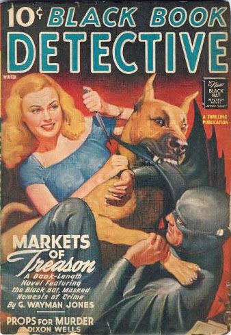
Foster’s own faulty memory really messes the issues up. He didn’t remember the editors or people or exact dates (and no real reason he should after all that time). But, those facts are significant as this time period covered 1936-1939. Superman didn’t debut in comics until 1938! Before 1938, DC Comics might be a vehicle for some of his cartoons, but Batman would have been too different. Superman had the luxury of a sympathetic editor, space in a new book to fill and the fact that Siegel and Shuster were already doing a variety of strips for DC. Post – Superman and we’re looking at DC turning down an idea when they were looking for just such an idea and then somehow for some reason passing it off to another creator in a very short period of time.
Yet we know Foster’s Batman (as well as Siegel & Shuster’s Superman) pre-dated 1938 according to the notes. But even then there’s conflicts between history and testimony that needs reconciling. Foster described this in a 1975 interview with a Boston attorney: “ … he got me interested enough to make some ideas up. And it seems to me that in those days, and even now, that most all of the strips were the heroes of the day – such as, flying through the sky during the day and doing good deeds and so forth and so on – and I thought, well, why couldn’t that be done at night? Have a good guy do stuff at night. So, I started working, just briefly, very briefly, not too seriously, with Al Capp, and cooking up a couple of ideas. … one of the things was Batman … “
See, the site says the early drawings are 1932. Superman didn’t debut until 1938. So, who the heck is he talking about flying and such? Just what was his inspiration for the character because the obvious ones just didn’t exist according to the dates on the drawings. Mandrake the Magician was 1934, the Phantom (1936), Flash Gordon (1934). The closest thing to these drawings in the strips was Buck Rogers but it’s quite a leap from Buck Rogers to Batman, even if you have Buck’s anti-grav belt.
Doc Savage maybe? Except Doc didn’t debut until 1933. The only notable hero before this drawing is the Shadow and he was hardly flying around doing good during the daytime. Foster’s other hero on the site is of the Raven, complete with a council of agents it appears is dated the same year as the Shadow’s appearance. But, once you start looking at the pulps, the costume being tights is an anachronism.
Beginning to see the crux of the problem? Foster’s Batman not only pre-dates Kane’s, but it also conveniently pre-dates many of the evolutionary steps along the way, as if he sprung out Athena-like from Zeus’ forehead as a fully realized conceptual costumed comic mystery-man. Foster’s Walt Gibson, Lester Dent, Siegel and Shuster, Alex Raymond and Lee Falk all rolled into one. With a touch of Dave Cockrum/Gil Kane as his costume is very stylized with its design elements compared to the far more simplistic and minimalist costumes of the early mystery men. His cowl alone with the flanged eye pieces is more a design element that would be at home more than a quarter of a century later. Foster talks about his creation as if it’s in response to other characters out there which should place the drawing 1937 at the earliest, but the dates the site claims are the dates of creation would indicate that instead he was creating something truly revolutionary, the first American comic crime-fighter ever to wear a distinctive mask and skin tight costume.
Yet, in 1998, the Boston Globe did run an article on Foster and Batman. You can search for it on the archives of their website. And, as far as my research online reveals, Al Capp was indeed in Boston in the early 30’s.

|
